"Urban, if not urbane."
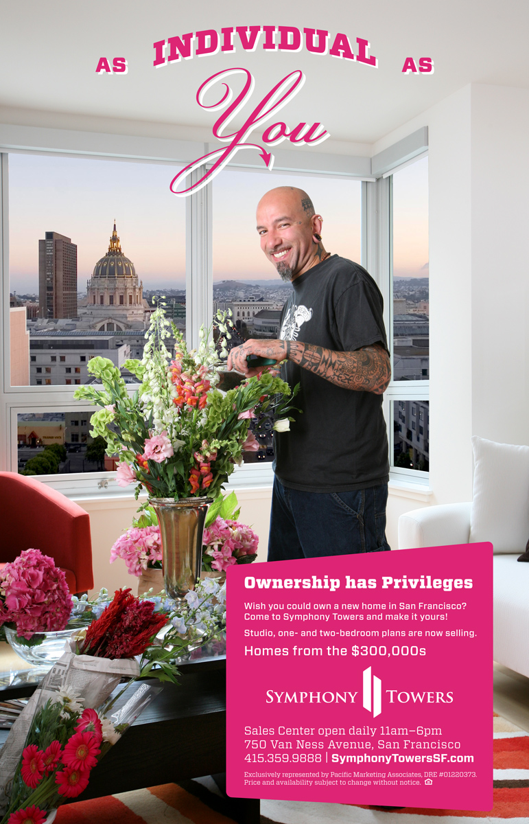
Symphony Towers takes up three spaces on this page because of the unique role I played in its marketing efforts. I worked on the development while at Pacific Marketing Associates as the Project Manager, then in a freelancing capacity as a designer.
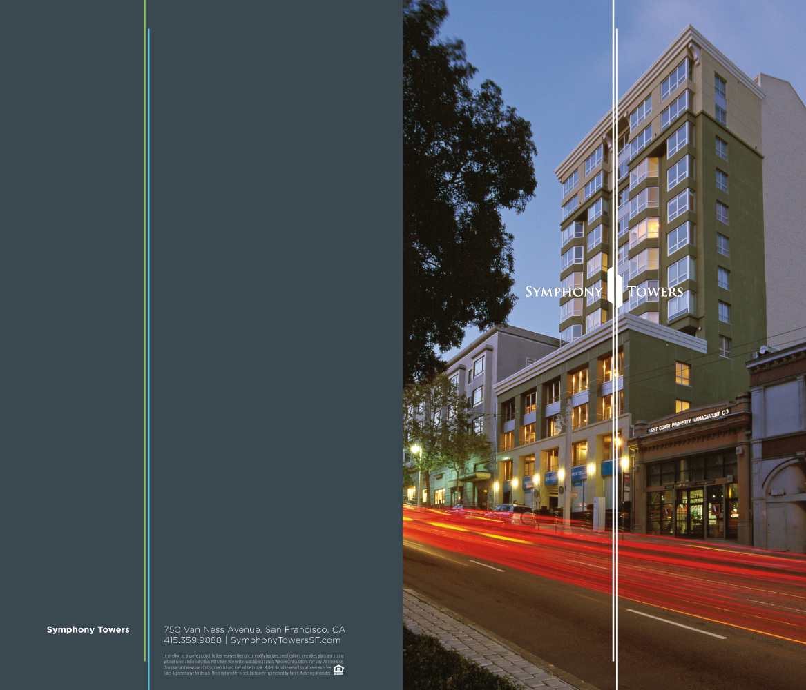
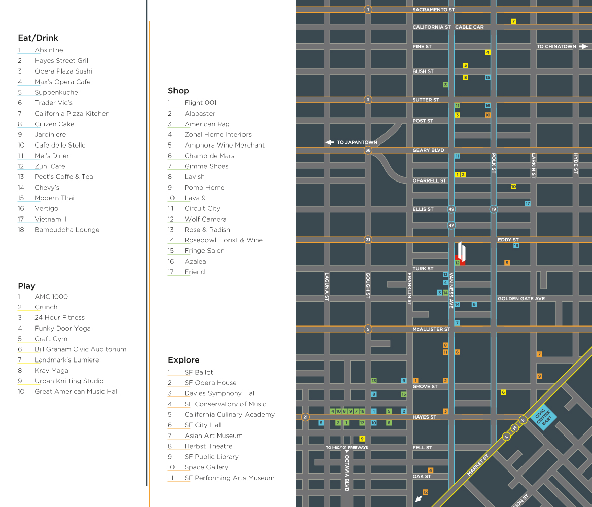
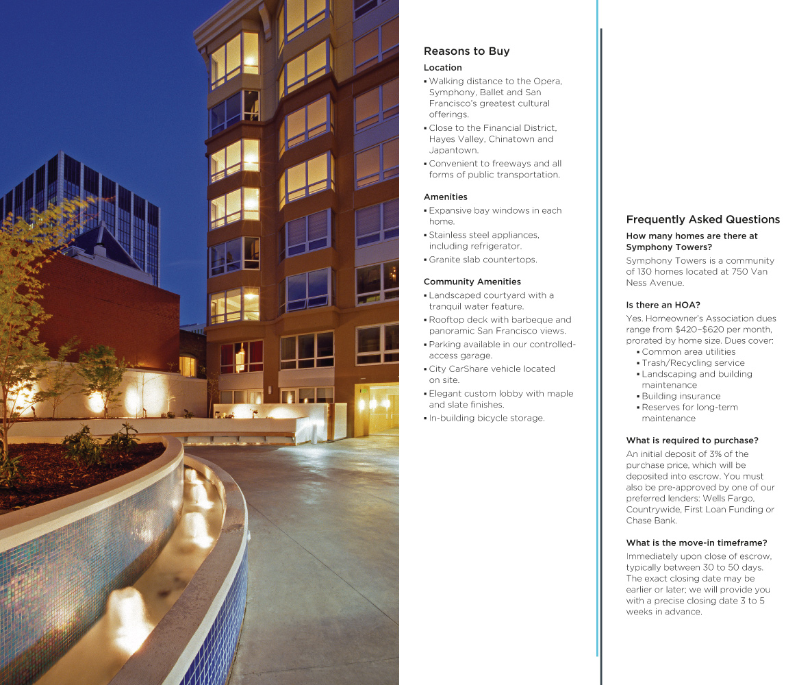
Symphony Towers is located on Van Ness at Turk in San Francisco—close to the symphony and ballet, but equally close to the Tenderloin. It's location and large number of inexpensive (by price-tag if not price-per-square-foot) studio units made the building a perfect choice for a San Francisco pied-á-terre. However, the primary target market was first-time homebuyers looking for an entry point into the City's high-priced market.
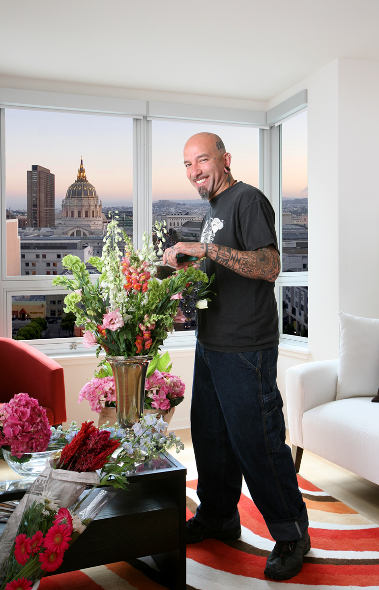
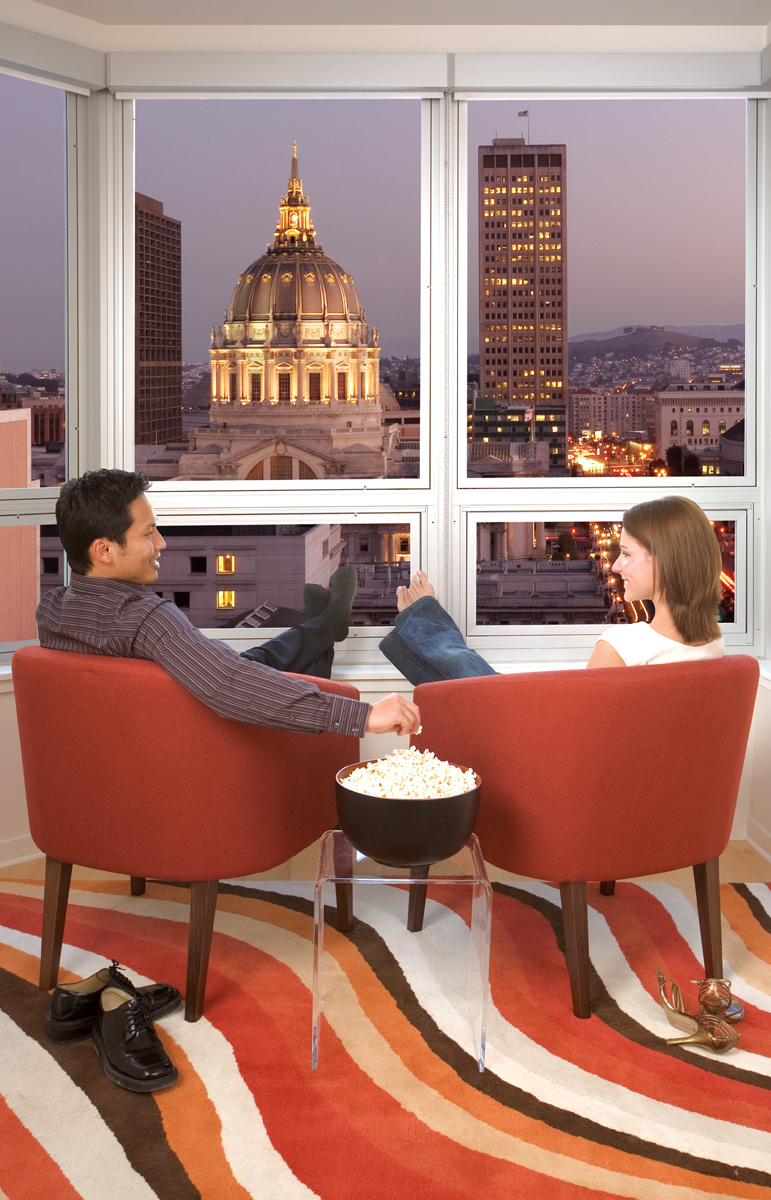
I created this photoshoot to target first-time buyers, and to highlight the aspect of ownership most overlooked in real estate advertising: customization. First-time buyers moving from an apartment finally get to paint, hang photos, make a mess and not have to worry about a security deposit. Tax deductions are great, but they don't bear an emotional attachment for a buyer the way personalizing one's home does.
Shoot Design & Direction / Photographer & Model Selection / Image Retouching & Compositing


Symphony Towers is a large building with a tiny Sales Center. There was only one wall to squeeze in all the information the sales team required to tell the building's story. Also, the sales agents were located next door, so prospects needed to be engaged until an agent came to meet them.
My solution was to create an interactive installation combining information and lifestyle photography on a grid of two-sided panels. On one side of each panel was building information. On the other side was a selection of photography. Visitors were encouraged to "play" with the display, flipping panels to reveal information or images. Each panel rotated independently and clicked into place on a custom hinge to maintain a flat surface. The full display could be configured in 262,144 possible permutations, so each visitor experienced it differently.
Concept & Information Design / Hinge Design (with Fabricator)


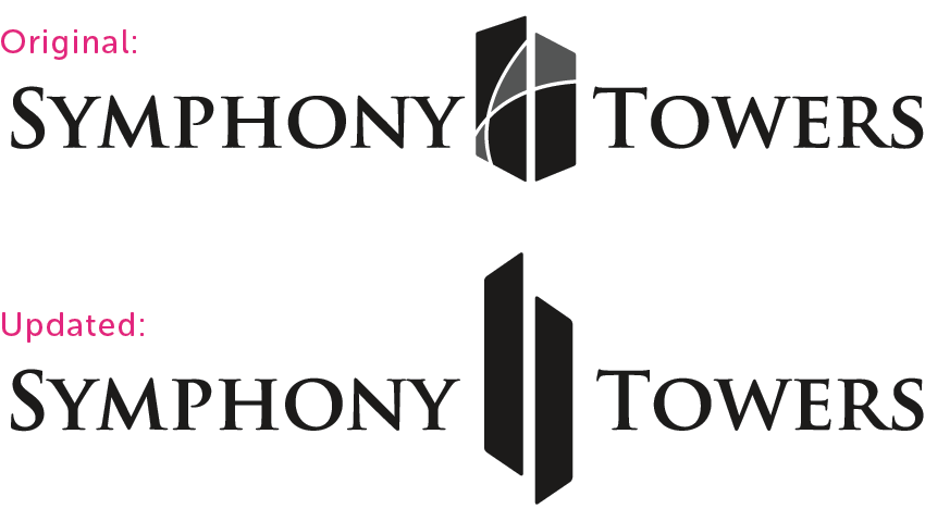
At Symphony Towers, the sales team was running out of brochures and the marketing team was looking to update the brand. It was the perfect time to clean up the logo and create a "mini brochure" that was less expensive to print and better reflected the remaining inventory and the target demographics.
Logo Redesign / Brochure Design / Copywriting / Image Retouching

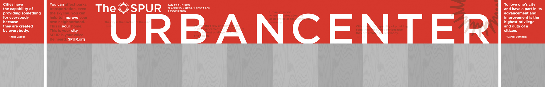
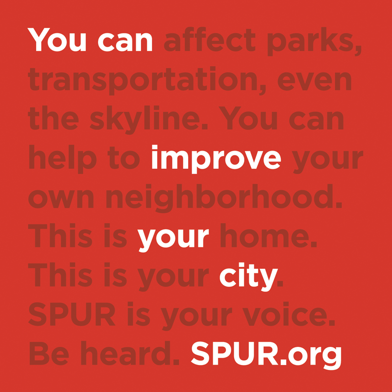
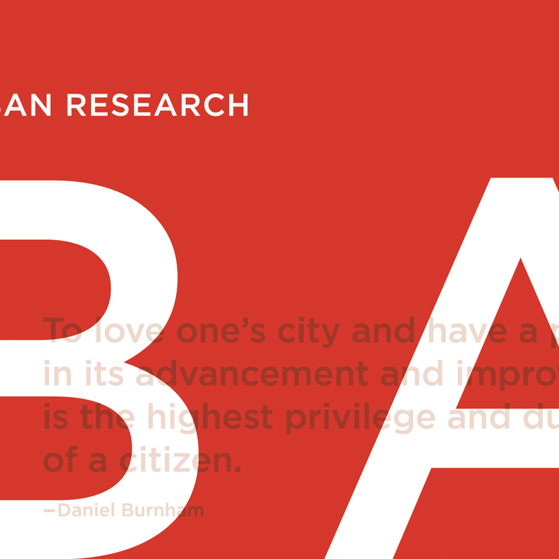
SPUR's Urban Center on Mission Street in San Francisco was under construction and needed signage to adorn the plywood barricade surrounding the site. The barricade was frequently tagged, so the signage had to be inexpensive enough to reprint. It also had to engage passersby on both the sidewalk and in automobiles.
I worked with developer Erik Robbins to research urban- and community-themed quotations that were in line with SPUR's philosophies. These quotes were screened back on the name and logo at various heights to be eye-level with pedestrians.
The sign was broken up into four-foot sections—the width of a sheet of plywood—so a section could easily be replaced without the need to reprint the entire sign.
Design / Print Management
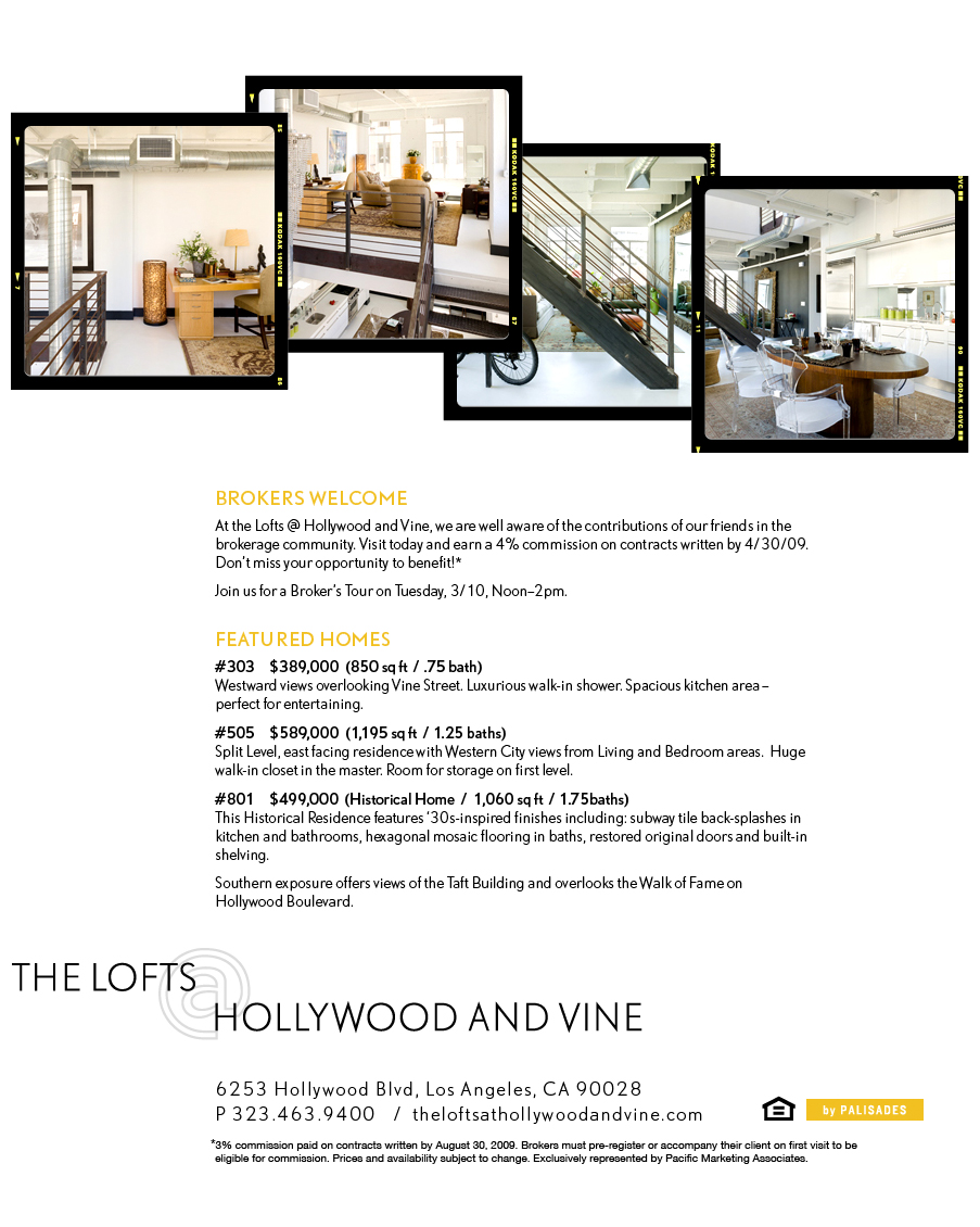
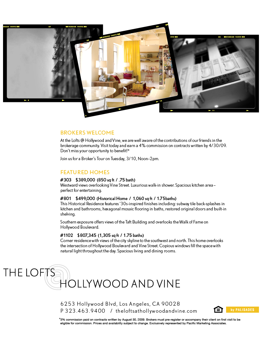
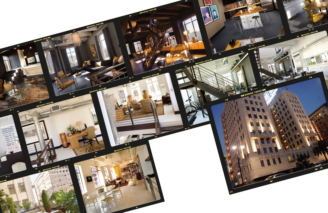
The Lofts @ Hollywood and Vine is a beautiful building at a prestigious and storied intersection. My job was to freshen up the look of the materials (though, sadly, I was not allowed to remove the "@" from the logo). My goal was to connect the look of the materials with the airiness of the lofts and the history of the location...and still meet the project's short deadlines.
For the informational eblasts, I stripped away the original grayish-blue and teal background in favor of stark white. I converted the exterior photography to grayscale, increased the contrast, and added a vignette and tilt-shift to invoke a moody, silent film feel. The interior images I warmed and lightened, added a custom film border, and unevenly dispersed them as though they were laid out on a photographer's light table.
Design / Photo Processing & Retouching / HTML Coding
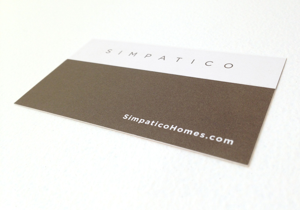
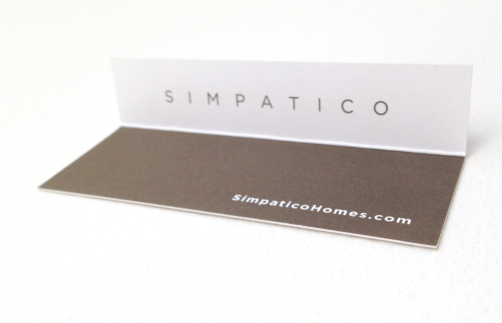
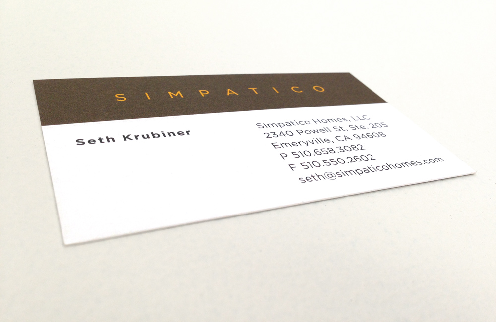
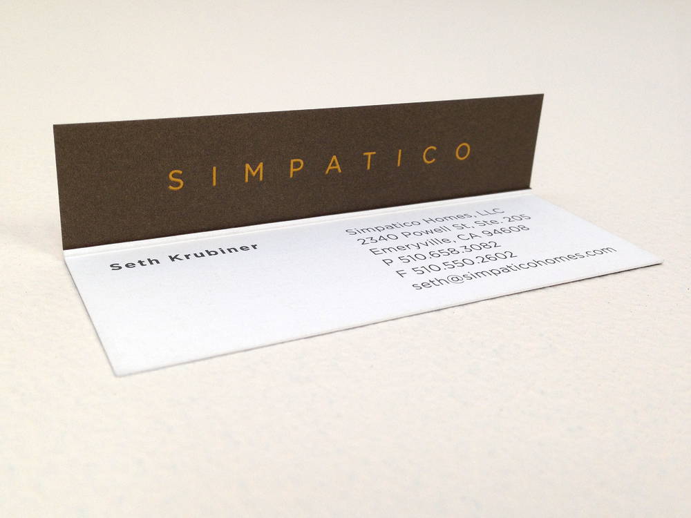
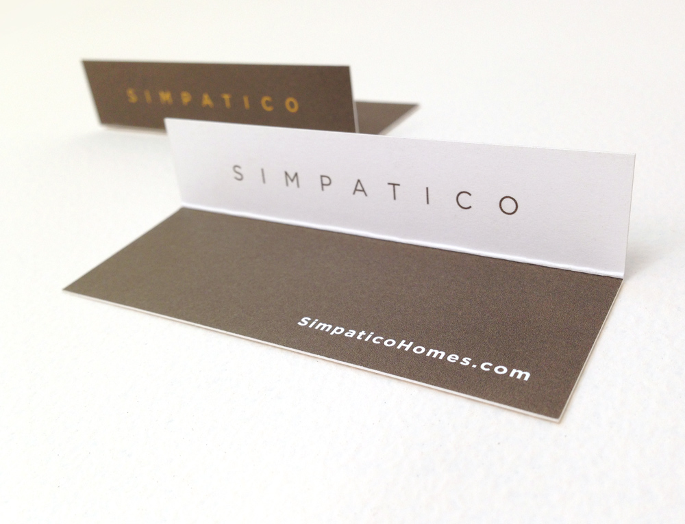
Simpatico Homes manufactures prefabricated, modular houses that don't look like they were built in a factory. Each home is customizable, built sustainably, and boasts a modern aesthetic.
The owner knew he wanted a card that reflected his business. Of course it would be printed on recycled paper, but it also had to do something. After numerous designs involving notches and die-cutting, we landed on this design, which was simple, cost-effective, and captured the "pop-up" aspect of homes that are assembled on-site in a single day.
Logo & Business Card Design / Print Management
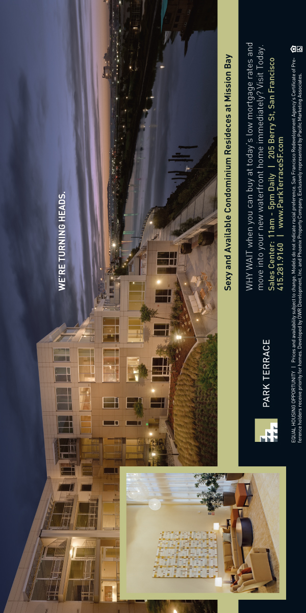
Sometimes it doesn't take much to jumpstart a campaign. At Park Terrace, traffic was stagnating and the marketing budget was about spent. I was tasked with updating the print ad, yet maintaining the look and feel of the current campaign.
The headline at the time was "Sexy and Available" and the ads were vertically oriented. I made only a slight change to the campaign, rotating the ads 90 degrees and adding a new headline. The result dovetailed with the previous message and content, but felt new again.
The client was especially happy: I was paid by the hour.
Design / Copywriting (Headline) / Photo Retouching